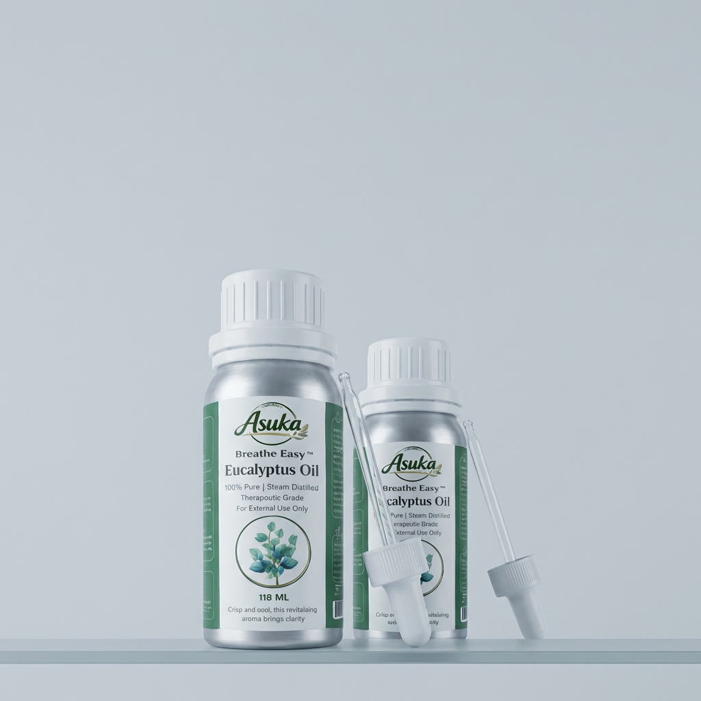
Product Generation
Product image generated through custom model training. Learn more or view our terms of service here.
Prompt
Prompt used to generate this image
Product
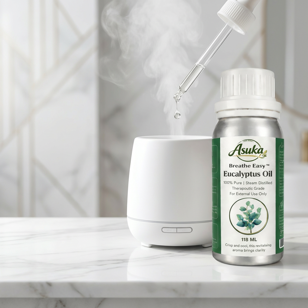
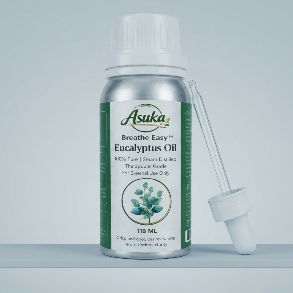
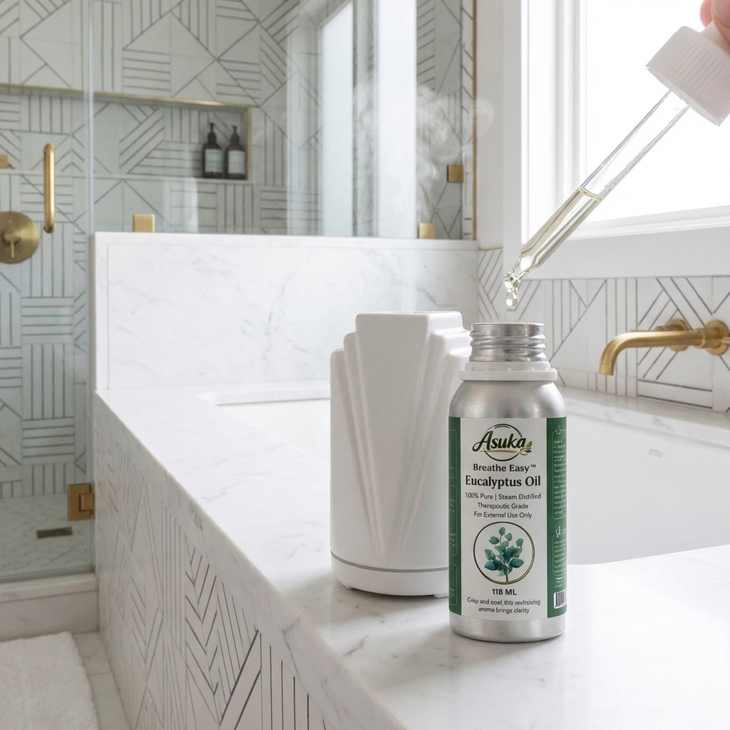
photo of ONQR8
STRICT REFERENCE-LOCKED COMPOSITION
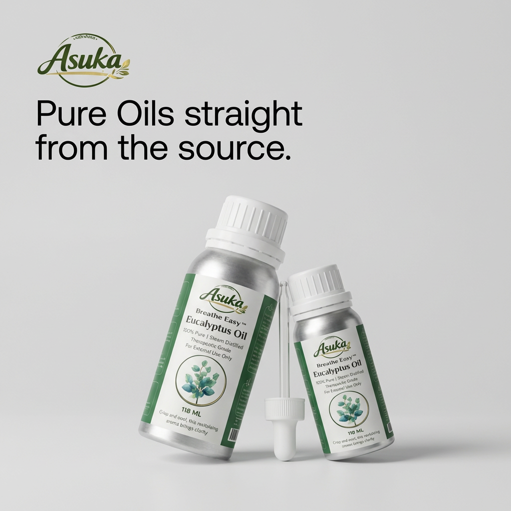
Create a premium editorial product image that closely follows the exact composition, spacing, and visual structure of the attached The Ordinary reference image.
GOAL:
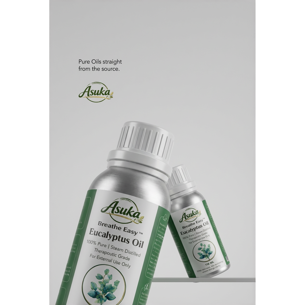
Recreate the same overall ad layout and brand mood as the reference:
- same vertical editorial composition
- same minimalist clinical beauty aesthetic
- same balance of negative space
- same soft grey seamless studio background
- same premium monochrome feel
- same understated luxury skincare campaign vibe
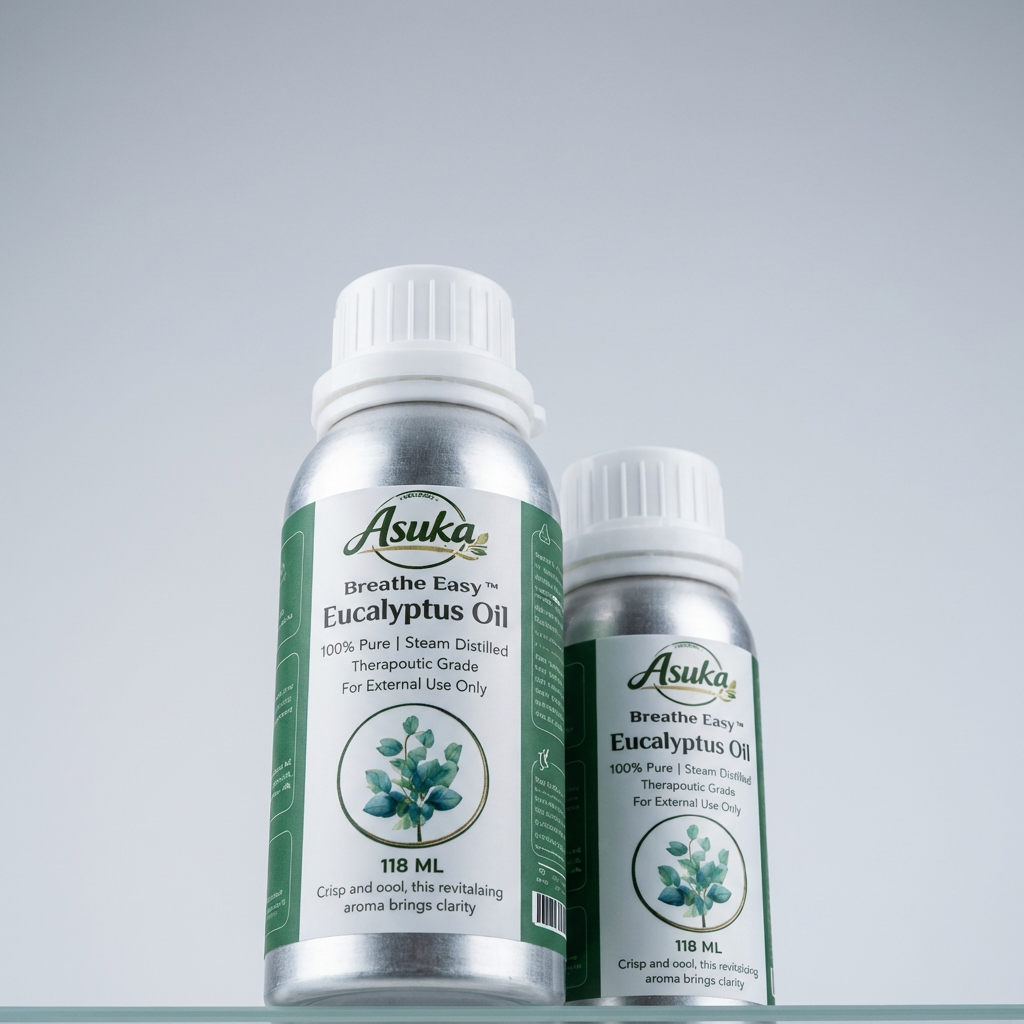
- same product placement logic with two bottles
- same text hierarchy and placement structure
IMPORTANT:
This is not a rustic natural oil ad.
This must feel like a clinical luxury skincare campaign in the exact visual spirit of the reference image.
PRODUCT LOCK:
Use my Asuka eucalyptus oil bottle as the product.
Do not change anything about the bottle:
- no label redesign
- no logo changes
- no color changes
- no cap changes
- no shape changes
- no proportion changes
- no smoothing or beautifying the label
- no rewriting bottle text
- no changing the metallic finish
The bottle must remain exactly as provided.
REFERENCE LAYOUT LOCK:
Match the reference image layout as closely as possible:
- vertical portrait composition
- large empty space in the upper half
- headline and logo area in the upper left
- two bottles in the lower half
- one larger bottle in the foreground on the left side
- one smaller bottle behind and to the right
- bottles cropped and scaled similarly to the reference
- subtle overlapping relationship between the two bottles
- similar camera angle and product tilt to the reference
- same sense of elegant asymmetry
- same clean editorial spacing
TEXT / BRANDING:
Replace the reference text with Asuka branding while keeping the same layout style and hierarchy.
Top small text area:
Pure Oils
straight from
the source.
Main logo area:
Use the Asuka logo exactly as it appears on the bottle, enlarged as a separate brand mark in the upper left area, similar in placement and dominance to the brand name in the reference.
TYPOGRAPHY STYLE:
- match the same minimal modern sans-serif editorial style from the attached Asuka listing image
- clean, refined, premium
- black or dark charcoal text only
- left aligned
- lots of breathing room
- understated, clinical, sophisticated
- not playful
- not decorative
- not bold sales copy style
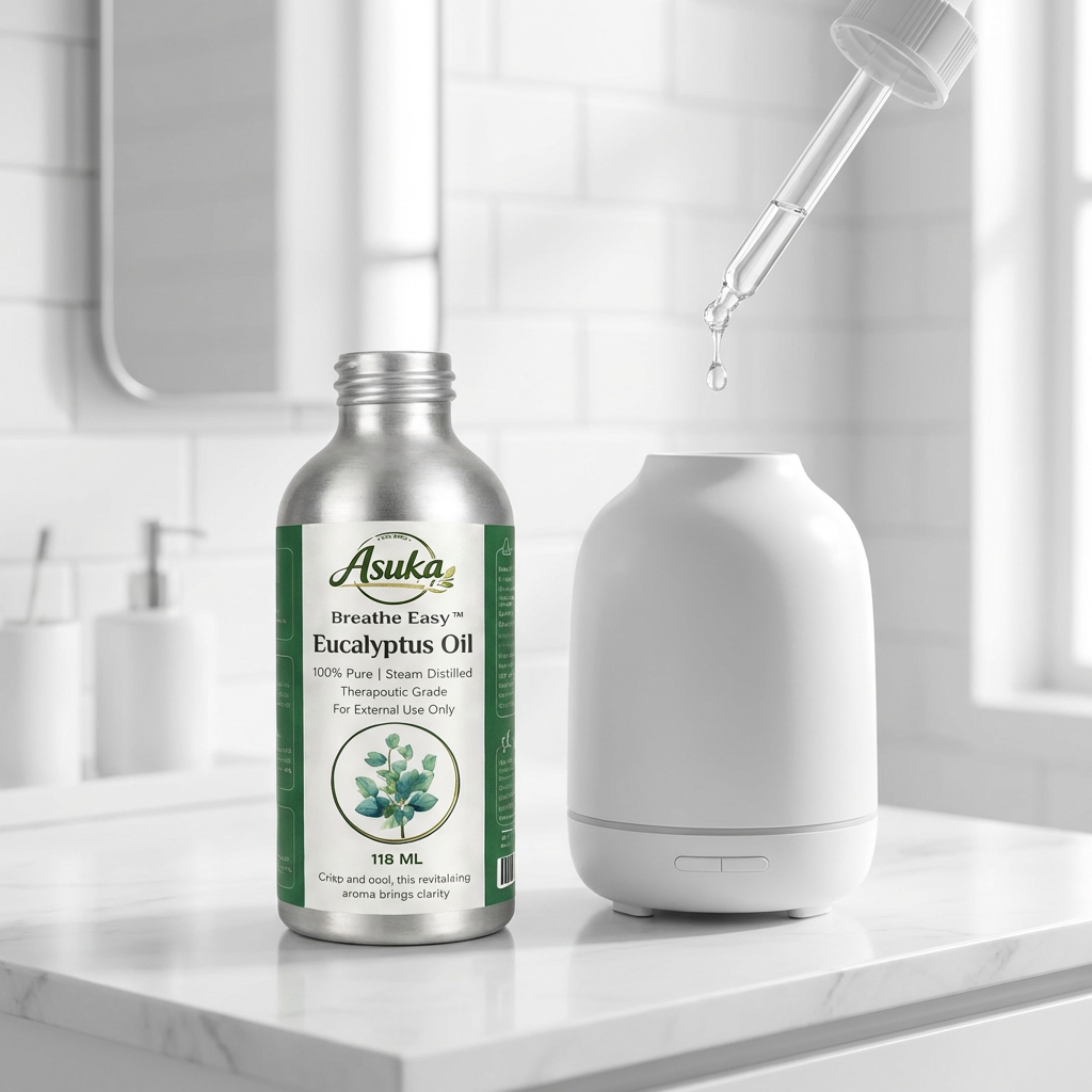
LIGHTING:
Match the reference image lighting style:
- soft diffused studio light
- even illumination
- subtle realistic shadowing
- clean premium highlights on the aluminum bottle
- bright but not harsh
- high-end beauty campaign finish
- no dramatic contrast
- no heavy reflections
- no warm golden tones
BACKGROUND:
- smooth light grey studio backdrop
- seamless and clean
- no props
- no texture distractions
- no environment
- no leaves
- no wood
- no water
- no natural styling elements
BOTTLE STAGING:
The two Asuka bottles should mimic the reference staging:
- larger bottle front-left, slightly angled
- smaller bottle back-right, slightly angled
- both grounded naturally
- elegant overlap
- realistic perspective and scale
- premium editorial crop similar to the reference image
STYLE RULES:
- luxury clinical skincare ad
- minimalist
- monochrome
- editorial
- modern
- premium
- clean
- sophisticated
- understated
- medical-beauty aesthetic
DO NOT:
- do not make it earthy
- do not make it botanical
- do not make it rustic
- do not add leaves or plants
- do not add oil splashes
- do not add droppers floating in the scene
- do not add extra props
- do not add warm spa styling
- do not make it look like a supplement ad
- do not make the text playful
- do not change the packaging
FINAL INTENT:
The finished image should look like Asuka created an ad using the exact visual composition language of the reference image, but with Asuka branding and the headline:
“Pure Oils straight from the source.”More Generations